Nebulous Theaters is a small chain of movie theaters in Colorado that specialize in critically acclaimed films & cult classics. The theater offers a a curated selection of new releases in addition to historically popular movies. The movie theater serves simple bar-style eats along with craft beverages.
Problem
Nebulous Theaters is seeing stagnant financial growth & their customer retention numbers are not where they would like them to be. The current ticket purchasing flow (online through a 3rd party) is also causing strain on employees, who often need to help customers though the process or to take orders via the phone.
Goals
In order to grow their business & take strain of of employees, Nebulous Theaters wants a mobile app centered around customer loyalty that:
Rewards loyal moviegoers
Incentivizes moviegoers to return to the theater
Allows customers to easily book (& redeem) movie tickets
User Research
Study Details
Method: Anonymous online survey
Location: Online in participant’s place of choosing
Date: 3/29/22
# of Users: 16
Gender: 50% female, 50% male
Average Age: 25-34 yrs
Social Preference
100% of users usually went to the movies with at least 1 other person. 50% of users preferred to go to the movies with friends.
Insight
It is worth building a feature that allows users to invite their friends to a showtime
Moviegoing Frequency
Results were evenly split into 2 groups: regular moviegoers (at least once a month) & those that only went to the movies occasionally.
Insight
In order to incentivise ocassional moviegoers to visit more frequently, gamify the rewards system.
Competitive Analysis
Pros
Easy navigation
Variety of features
Cons
Laggy loading times
Lack of pricing info for rewards
Pros
Highly visible location of user ID barcode
Strong branding
Pros
Lacking features
Difficult to navigate
Pros
Great copy/tone with strong branding
Very informative
Cons
Complicated e-commerce platform
Confusing menu organization
Gaps
Boring rewards program interface
Difficult navigation
Opportunities
Gamify the rewards program to encourage customer engagement
Age: 25
Education: Trade school Location: Minneapolis, MN Family: Relationship, no kids Occupation: Electrician
Goals
Receive rewards/perks for his avid movie-going
Coordinate movie trips with friend group
Share his love of film with others
Pain Points
Hard to coordinate movie-going with friend group
User Journey Map: Grace
Select a Movie
Tasks
Look up theater’s “now playing” on website.
Pick out a few movies that look good & read ifno.
Go over top options w/ spouse & pick one.
Feeling
Overwhelmed by movie options
Excited to see selected film
Opportunities
High cost of movie-going
Lack of motivation
Book a Sitter
Tasks
Text babysitter asking if they are available at desired showtime.
Book session for available showtime.
Send reminder to babysitter day before movie.
Feeling
Nervous if sitter might not be available or will cancel
Hopeful that sitter will be available for top date/time
Opportunities
Flexible cancellation policy
Buy Tickets
Tasks
Find movie on website, click “book now”.
Select wheelchair-accessible seats.
Enter in payment info & check out.
Feeling
Hopeful that good seats will be available
Annoyed at needing to go find credit card
Opportunities
1-click payment
Clearly marked wheelchair-accessible seats when booking
Go to Theater
Tasks
Get house / self / children ready & greet sitter.
Look up directions on phone & drive to theater w/ husband.
Look up email w/ ticket confirmation & pull up for theater attendant to scan.
Feeling
Stressed from coordinating tasks
Excited for a nice date night
Opportunities
Easy access to ticket QR code
“Find directions” button
Buy Food & Drinks
Tasks
Once in theater seats, look at printed menu & select a meal.
Place order when attendant comes over.
Pay with credit card when paper receipt comes.
Feeling
Eager to eat tasty food
Impatient waiting for server
Happy to finally be at theater
Opportunities
Order & pay for food via smartphone
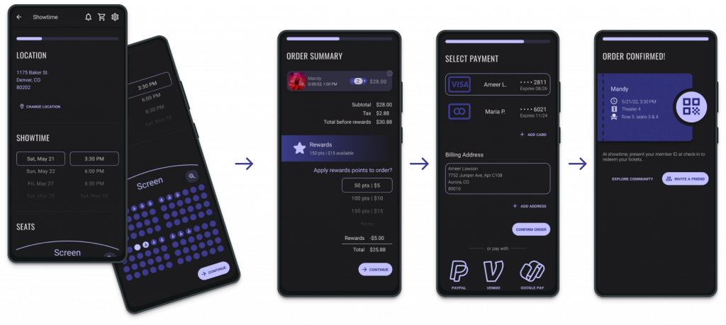
User Flow
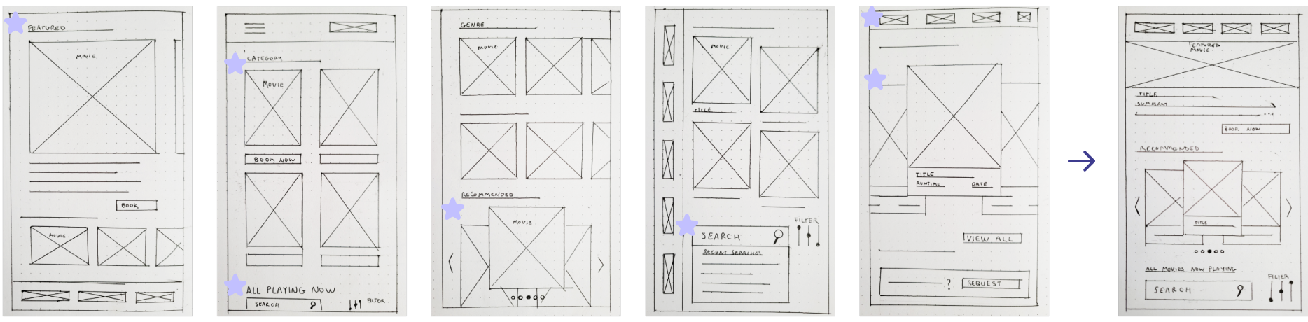
Paper Wireframes
Paper wireframes were developed in order to visualize main screens, create big picture as well as close-up storyboards, & to start developing the mobile app’s informational hierarchy.
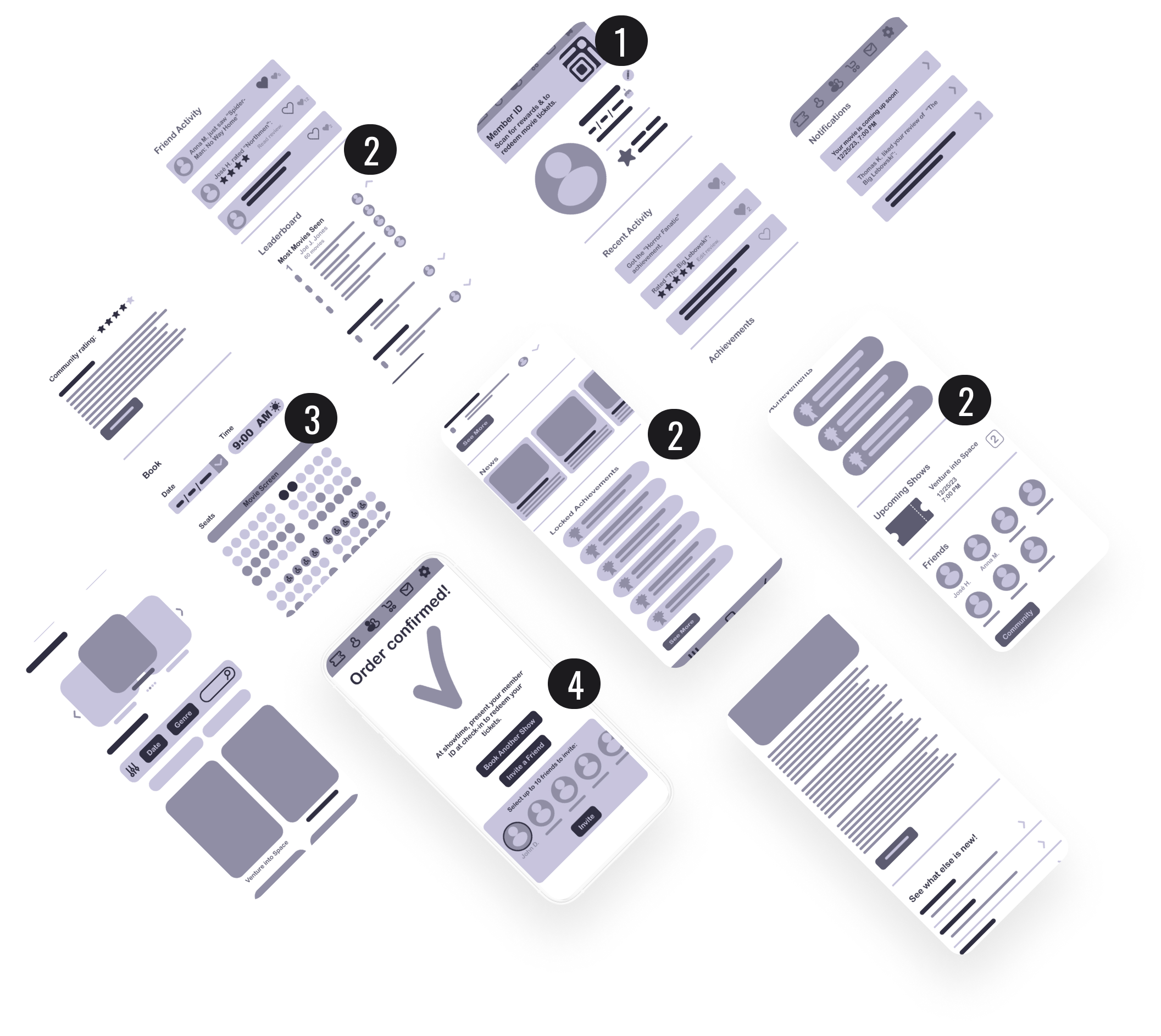
Digital Wireframes
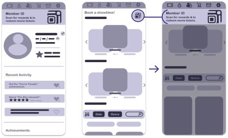
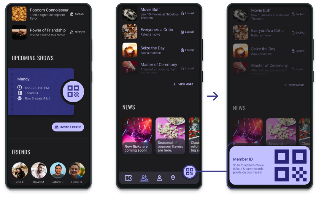
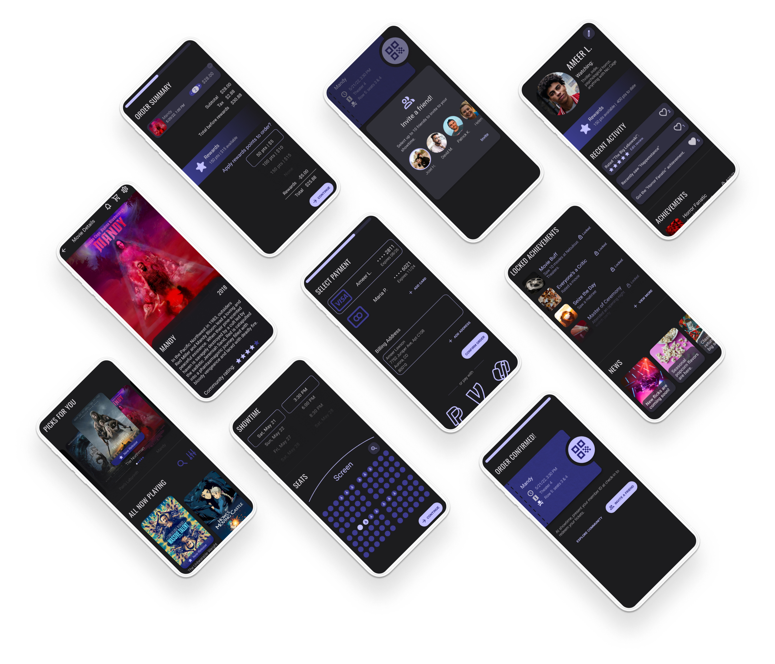
A highly visible member ID banner allows users to scan user ID at box office for easy movie ticket redemption.
The community leaderboard & achievment banners motivate users to increase moviegoing activity.
Users are able to book showtimes with accessible seating.
The invite-a-friend features lets users coordinate showtimes with friends.
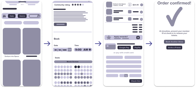
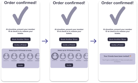
Lofi Wireframe Prototype
Purchase Flow
Invite-a-friend flow
news post flow
Member ID + Flow
Top Nav.
Bottom Nav.
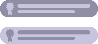
Achievements
Want to test out the prototype yourself? Click the button below for the interactive prototype on Figma.
Through user testing, the following observations were made about features in the Nebulous Movie Loyalty app.
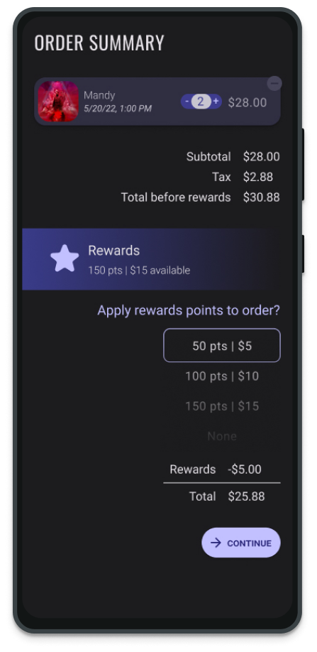
Rewards
“There aren’t a lot of clues that the reward points have been applied to the cart“
“I’d like to have a better way to apply my movie rewards in the checkout process. […] I wasn’t quite sure if the Check option was interactive until I clicked on it anyway.“
“…I’d also like to see how many pts/rewards I have in my account right underneath.“
Got stuck on page after selecting “apply rewards”.
Member ID
“The member ID is difficult to discern (I just guessed that the top right icon represents the ID).“
“The icon to scan your ticket at the cinema could be integrated better. i like that it’s right on the screen and that you dont have to go to the tickets tab (Which i tried to do). But I’d like it to be more discoverable.“
“>Stuck on page 17.5 seconds before finding member ID from “Book Now” page.
Clutter
“Some pages are more cluttered than others, so maybe adding multiple stages in the ordering process and summarizing at the end.“
“Maybe more negative space and on the homepage“
“Less clutter.“
Navigation
“I also expected the scanner to be on the main navigation bar at the top!“
“I don’t like how the menu is on the top of the screen. It’s very far from my thumb’s reach.”
Data Synthesis
Observation
Insight
6/8 participants…
Went from “Book Now” screen to retrieve their member ID.
I should prioritize visibility of this feature on the “Book Now” page rather than on the profile page.
3/8 participants…
Wanted a clearer icon to represent the member ID.
I should use a clearer, more universal icon for member ID / ticket.
Didn’t complete the “apply rewards to check out” flow.
I can create a smoother user flow on the checkout screen by:
Breaking up information-heavy screens.
Using progress indicators to guide users through the flow.
Said that the design of the app was too cluttered.
I can utilize more negative space in the app design & can break up information-heavy pages into sections/screens.
Data Synthesis
6/8 participants…
Observation
Went from “Book Now” screen to retrieve their member ID.
Insight
I should prioritize visibility of this feature on the “Book Now” page rather than on the profile page.
3/8 participants…
Observation
Wanted a clearer icon to represent the member ID.
Insight
I should use a clearer, more universal icon for member ID / ticket.
Observation
Didn’t complete the “apply rewards to check out” flow.
Insight
I can create a smoother user flow on the checkout screen by:
Breaking up information-heavy screens.
Using progress indicators to guide users through the flow.
Observation
Said that the design of the app was too cluttered.
Insight
I can utilize more negative space in the app design & can break up information-heavy pages into sections/screens.
Post-Feedback Iterations
*For the sake of clarity, mockups may not display navigation & system bars that would otherwise appear in final product.
Member ID
Highly visible FAB on fixed bottom nav. bar
Buttons trigger large QR on click
QR code icon updated for clarity
Button on profile section
Movie ticket imagery used to imply QR can be used as a ticket
Checkout Flow
Checkout divided into 4 screens (“Movie
Details” are on a separate page)
Progress indicator guides users through checkout flow
Payment is simplified with stored cards on file & 3rd party quick-pay options
Rewards Points Application
Point quantity selection rather than all-or-nothing approach
Explanatory points labels with dollar values
Total with savings is now calculated sequentially
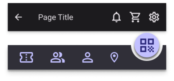
Navigation
Simplified page selection
Main nav. fixed on bottom for easy thumb reach on any page
Contextual top nav. for easier navigation
“Notifications” icon updated for clarity
A Closer Look
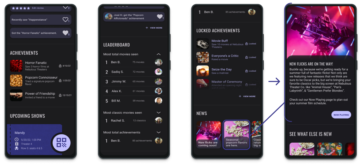
Achievements & Leaderboard
I wanted achievements to be fun & accessible, even for those who are occassional moviegoers. In order to inspire engagement, it was important to show when friends had gained an achievement & to display community leaderboards for moviegoing activity.
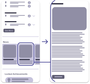
News Post Flow
The news reel on the Community page allows Nebulous Theaters to share updates with moviegoers.
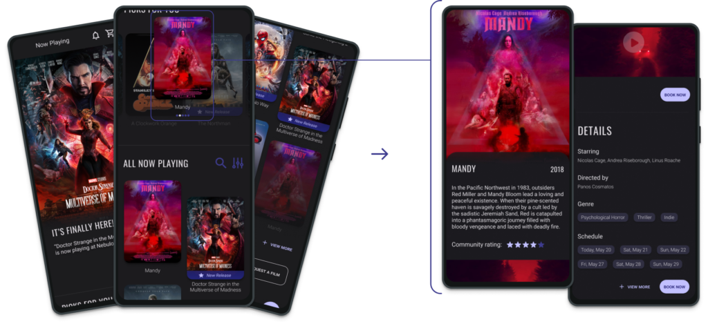
Movie Selection User Flow
Users Select a movie from the Book Now page & are directed to a Movie Details page.
Click the button below for the interactive prototype on Figma.
Ability to book physically accessible movie seating
Linguistic
Clear icons for limited literacy
Device Limitation
Native dark theme for reduced energy consumption
“Accessibility allows us to tap into everyone’s potential.” –Debra Ruh
Moving Forward
Impact
By providing users with an easy way to book seats, save on movies, & invite friends to showtimes, this app creates a powerful sales funnel for Nebulous Theaters. Not only does this increase revenue on ticket sales, but it nurtures a symbiotic relationship with users.
Insights
This was an amazing way to go through the full wholistic design process. Learning the cross-functionality of roles like UX researcher & motion designer allowed me to have a greater appreciation of the all of the moving parts in a project.